

The Joy of Hockey Jerseys
Thursday, 16 August 2007
Originally written in 2003
By Lucas Aykroyd
It’s a symbol of team pride. A marketing tool. And yes, a fashion statement. In pro sports, the brightly colored, boldly named team jersey fills all these roles. Let’s take a closer look at the threads that make up this story by examining today’s National Hockey League.
The NHL is particularly aware of the importance of jerseys because it needs to heighten its profile in the United States relative to major league baseball, basketball and football. For instance, in 2002 NHL revenues hit an all-time high of $1.9 billion, but 80% of that was from ticket sales and arena revenues, compared to just 30% for football. So selling more jerseys is a way hockey can start catching up with other leagues.
While hockey is a national passion in Canada, Americans mostly view it as a regional sport, and the logos chosen for US NHL teams often mirror regional specialties.
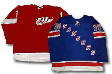
A large green star appears on the Dallas Stars jersey, reflecting the pride of Texas as the “Lone Star State.” The team was known as the Minnesota North Stars before relocating to Dallas in 1993, so fortuitously they didn’t have to change much. The wheeled wing of the Detroit Red Wings harkens back to the car manufacturing roots of the “Motor City.” The big leaping cat that adorns Florida Panthers jerseys derives not only from the desire to promote an aggressive team spirit but also from the fabled predators that roam the jungles of the “Sunshine State.”
But as in other sports, whimsy often triumphs over logic. The only real “Penguins” you’ll find in Pittsburgh live at the zoo, and no one is quite sure what “Predators” live around Nashville (apart from some unscrupulous country music execs?).
Recent expansion franchises often use jerseys that are marketing masterpieces. In their inaugural season of 1991-92, the San Jose Sharks were a disaster on the ice with 17 wins, 58 losses and five ties. But their new jerseys caught the wave when teal was at its trendiest, and they racked up $150 million in merchandise sales, accounting for 27% of the NHL’s total that year.
People laughed when the Anaheim Mighty Ducks entered the NHL in 1993, with logos featuring a “menacing” duck wearing a goalie mask. How could a team whose style originated with Disney hockey movies be taken seriously? But jersey sales and gate receipts soared when the Ducks fought their way to the seventh game of the 2003 Stanley Cup Finals against eventual champions New Jersey, enabling them to get the “last quack,” so to speak.
At the other end of the spectrum, you’ll find the jerseys of teams steeped in history and tradition. You can’t mess with these logos, these colors. The Montreal Canadiens are a perfect example. Since joining the NHL back in November 1917, the Canadiens have sported the same “bleu, blanc et rouge” (blue, white and red) colors with the same distinctive CH logo, standing for “Canadiens Habitants” (or, native Canadians). Long identified with the spirit of the French-Canadian people and blessed with 24 Stanley Cup victories, Montreal would commit sacrilege in the eyes of their fans if they changed that jersey.
Even for franchises with shorter histories, changing the uniform can be fraught with hazards. For instance, the New York Islanders won four NHL championships (1980-83) with a logo featuring a map of Long Island surrounded by a circle.
But in the fall of 1995, they decided to update their look. The Islanders went for a grizzled fisherman brandishing a hockey stick and switched to a deeper shade of background blue, highlighted with orange, green and silver. The move backfired, as the fisherman was widely derided as “Mr. Fish Sticks,” and the team’s mediocre performance prompted a return to the original jerseys by 1997.
A 2002 poll in the Montreal newspaper La Presse voted the jersey worn by the Vancouver Canucks from 1978 to 1985 as the worst of all time. Usually dubbed the “Halloween costume,” it had a huge red and black V motif on a mustard-yellow base. Apart from a Cinderella run to the Stanley Cup Finals in 1982, the Canucks fared poorly in this era, contributing to the jersey’s demise.
Tragicomically, the team had consulted with a marketing firm before adopting this jersey. The supposed rationale for the design was that it would make Vancouver appear more aggressive. That didn’t work.
The Philadelphia Flyers, once nicknamed the “Broad Street Bullies,” have succeeded better than perhaps any other hockey club in solidifying their image through their jersey design. The flying P crest is memorable, but what really gets you are the outlines and color scheme of orange, black and white, which make the shoulders of even the skinniest rookie appear monstrous.
In the early 1980’s, the Flyers and the now-defunct Hartford Whalers participated in a fashion experiment. They wore long hockey pants instead of the traditional short ones under which garter belts hold up hockey stockings. The idea was to enable players to skate faster, but the downside was that they also ended up crashing into the boards harder when they fell. Both for tradition and for safety, the NHL outlawed the long pants in 1983. (Functionality is also behind the “fighting strap” inside each jersey; these prevent players from having their jerseys pulled over their heads during fights.)
Hockey teams traditionally wear light-colored jerseys at home and dark ones on the road. In the past, only stars like Wayne Gretzky and Mario Lemieux wore high numbers like 99 and 66. But in today’s NHL, neither tradition is observed rigorously.
And now, teams introduce alternative third jerseys for extra marketing clout. In Europe, clubs paper their jerseys with advertising logos, and the quest for the almighty dollar may someday lead to the same thing in North America.
Whatever the future holds, the hockey jersey will remain arguably the world’s most intriguing garment made of 100 percent polyester double knit.


